 Shahidatul Hidayah
What I sawScheduled saving used a fixed amount, whatever the week looked like.
What Payungku doesEvery plan is skipped on a low week.
Case study, 2026

A savings app that tells you how much is safe to save this week, and shows its working.
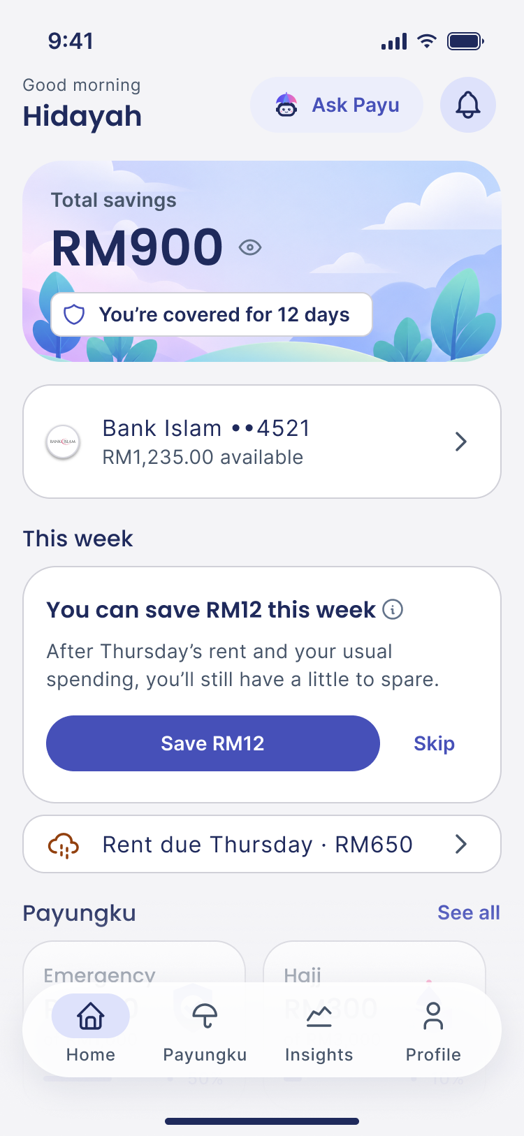
12 of 24 days covered. Rent, bills and food, not a percentage.







The problem
What the surveys say
What I make of it
In the middle of a month, it's hard to tell whether RM50 is spare or already spoken for. So people wait until payday, and by then it's gone.
People who want an emergency fund can't tell, week to week, how much is safe to put aside. So they save irregularly, or not at all.
How might we tell someone what's safe to save this week, and show why?
And 42% of young earners said they'd save more with a plan built around their goals.
RinggitPlus Malaysian Financial Literacy Survey, 2021 and 2023. PIDM and iMoney survey of 1,525 Malaysians aged 24 to 35, 2019.
The idea
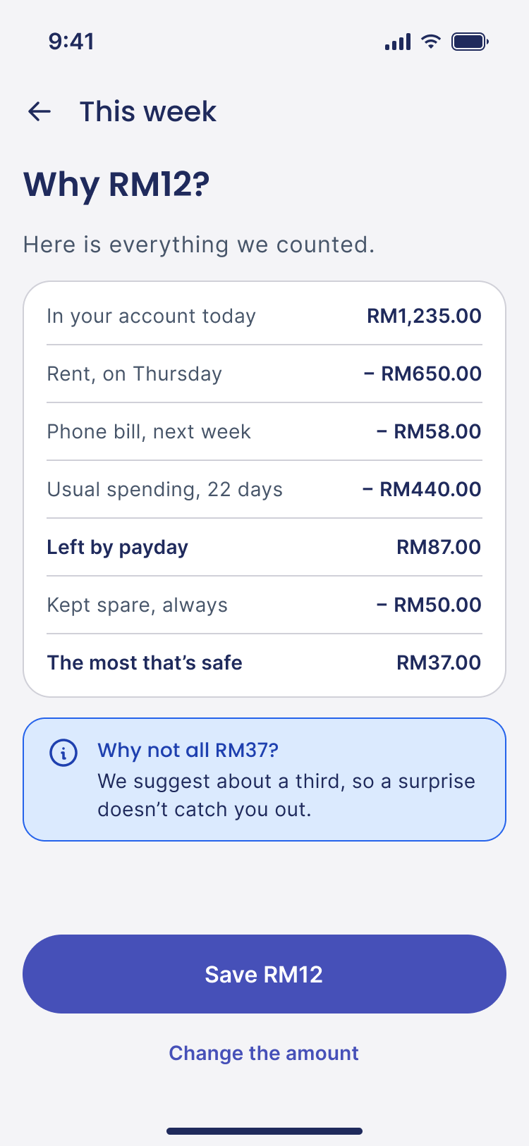
Payungku reads the balance, the bills due before payday and usual spending, then suggests an amount that is safe.
About a third of what is safe, so a surprise doesn't catch you out.
How Payungku was made
136 journeys recorded, and two national surveys.
One weekly decision, and an amount that is safe.
The sum, the screens, and a system another designer can pick up.
Real behaviour: a PIN that fills as you tap, a code that arrives as a message.
21 people used it, then scored it. Rated Excellent.
Next: time the sign-up and the save, and see where people stop.
Research















 CleoOportun
 This is where Payungku starts.
As recorded in my benchmark of 16 apps, 2026.
What I sawScheduled saving used a fixed amount, whatever the week looked like.
What Payungku doesEvery plan is skipped on a low week.
What I sawA secure approval for every single action.
What Payungku doesA PIN only when money leaves.
What I sawThe longest setup ran to seven or more screens.
What Payungku doesReady-made plans: one tap, then Create.
136 journeys recorded across 16 apps, 11 features compared.
The gap
People are asked to trust a number they can't check.
User personas
Hidayah set the direction. Aina and Azman stand for the two groups I tested with.

"I'd save more if I knew it wouldn't leave me short before payday."
Needs To know an amount is safe before she commits.
So the app Suggests one safe amount a week, and shows the sum behind it.
"I want to save, but I never know what I'll have next month."
Needs To be told when not to save, without feeling she failed.
So the app Says "Nothing to save this week, and that's okay", and makes Skip one tap.
Not solved yet Payungku works from payday, and she doesn't have one.


"Show me exactly what you're doing with my account before I agree to anything."
Needs To see what is shared, and to stop it at any time.
So the app Lists what it will and won't do before linking a bank, and never moves money without his PIN.
Personas built from desk research and refined after testing with 21 people.
Structure
Once 8 stages
From welcome to the first Payung. A person does this a single time.
The first saving unlocks 12 hours later. A safety wait for every new sign-up.
Every week 4 steps
One amount, the reason for it, then a yes. This is the product.
Optional Why RM12? The full sum, one tap away.
If no amount is safe “Nothing to save this week. Rent took most of it, and that's okay. We'll look again on Monday.”
Now and then 5 actions
What people do between saves.
Withdrawing is instant and is never shown in red. It is their money.
Everything else in the app exists to make the middle one trustworthy.
Four tabs
What should I do this week?
What am I saving for?
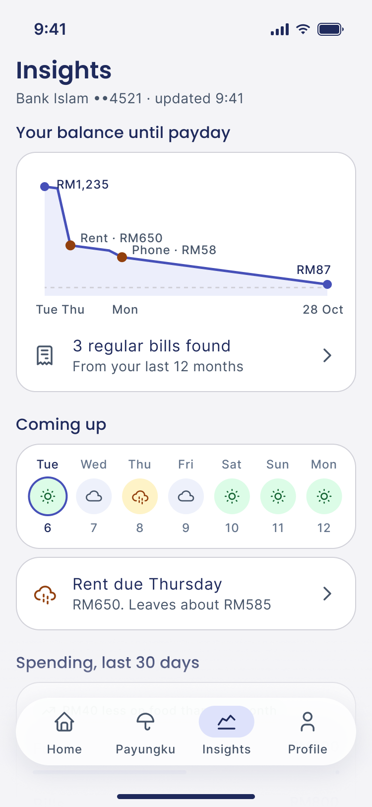
What is coming before payday?
What does the app know about me?
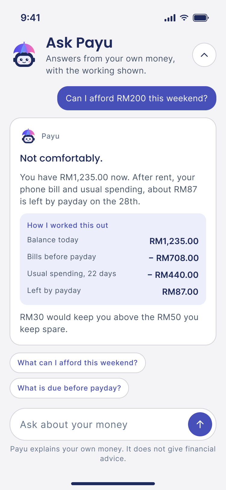
 Ask Payu
Why, and what if? Opened from Home.
Wireframes
Key screens in low fidelity, showing structure and priority without styling.
Interface
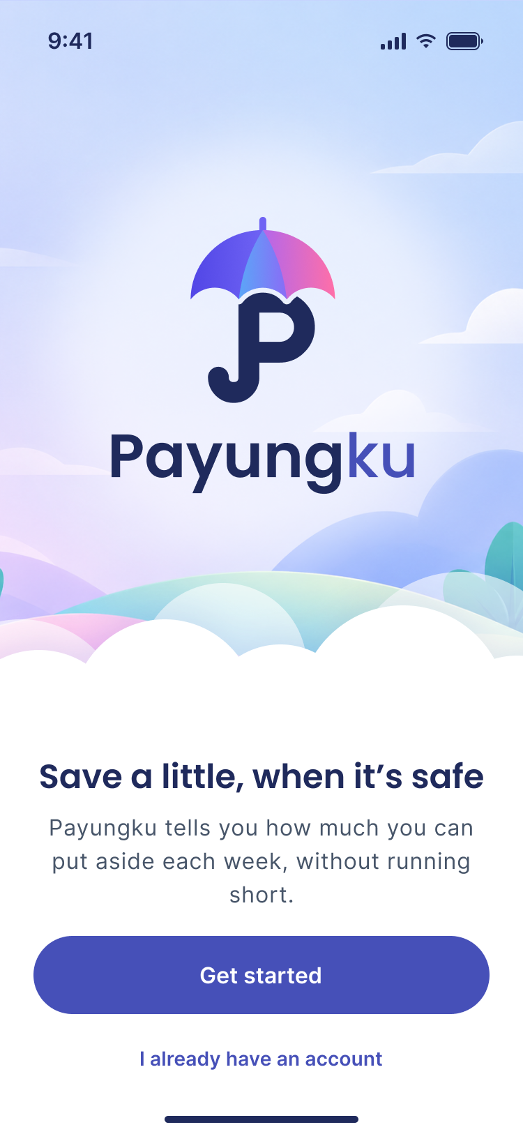
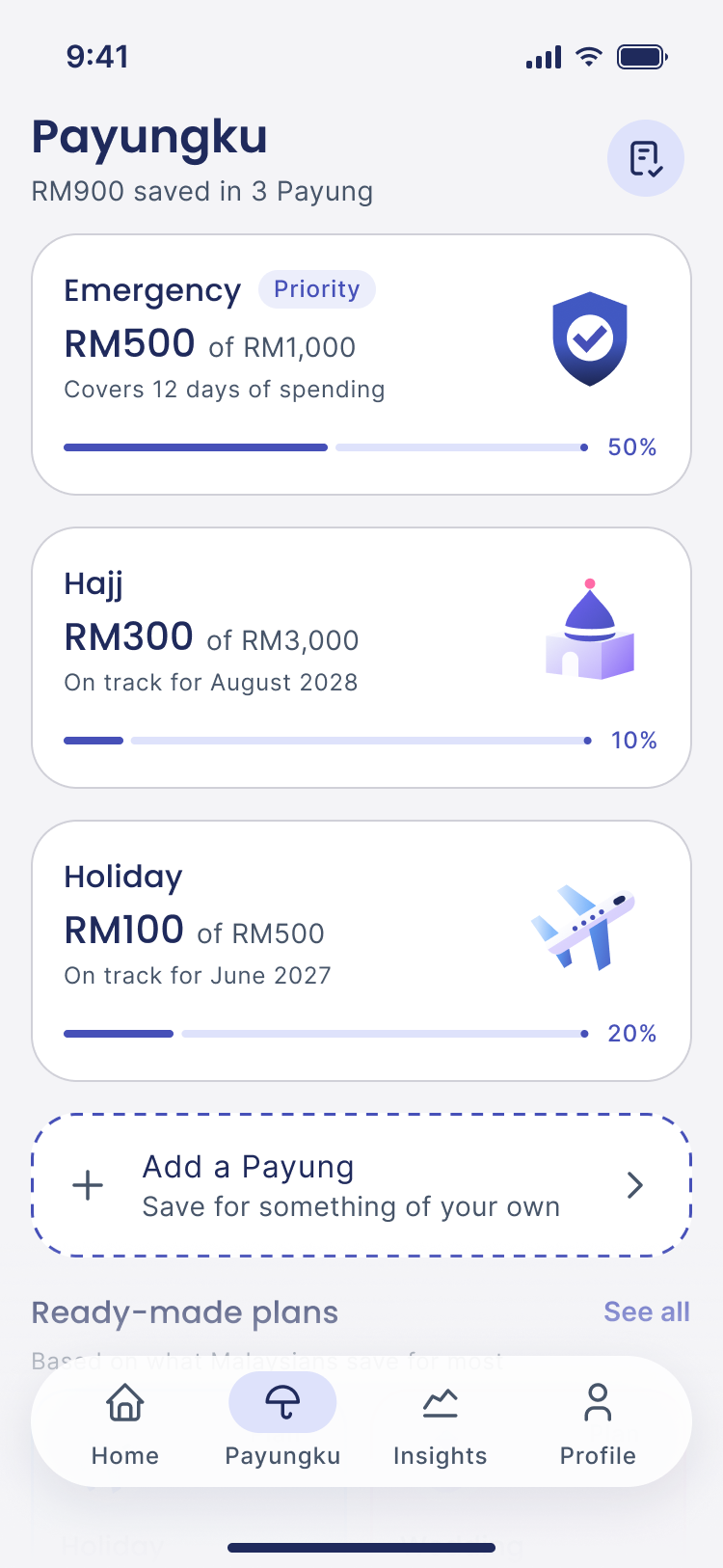
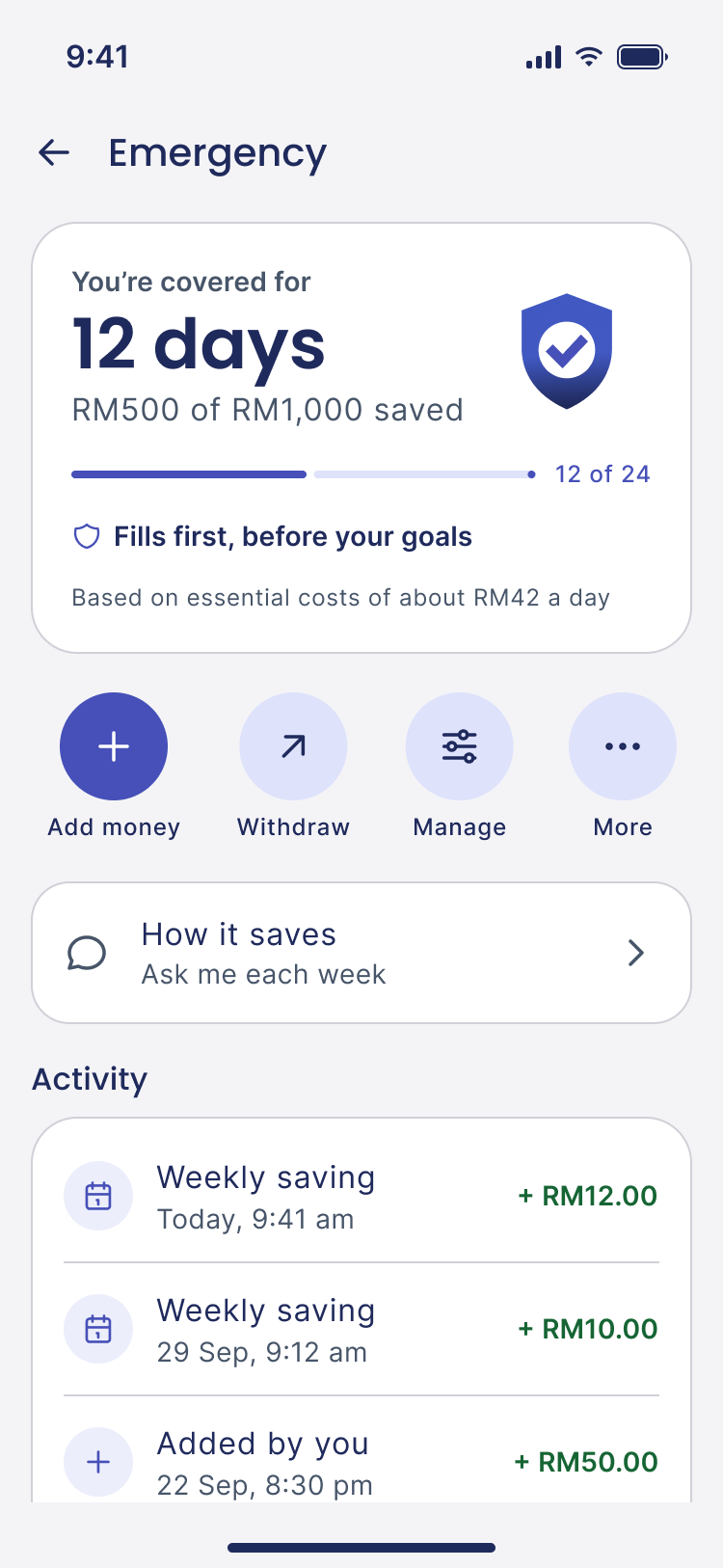
Design system
Built on Material 3, with every token re-pointed to Payungku. Change one value and every screen follows.
Titles, card names and large amounts.
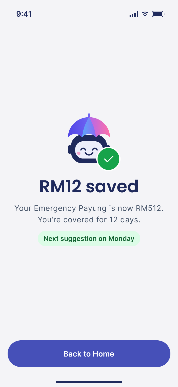
RM12 saved
Every list row, label and button.
Rent due Thursday · RM650
Edge cases and error states
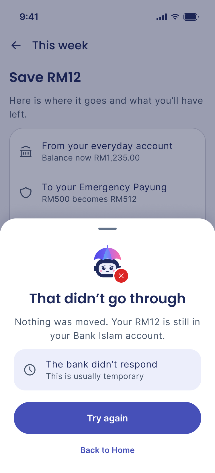
28moments where it can go wrong. Each one designed, so nothing is left for engineering to guess.
 1
2
3
The app takes the blame. “We couldn't read that”, not “Invalid image”.
Say what was not lost. “Nothing was moved.” “Nothing was shared.”
One main button. Never a dead end.
 Failed
 Try again
 Worth knowing
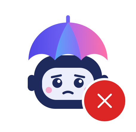
The face, the badge and the words all say the same thing.
Prototype
These are the flows people were given. They run here.
New user. Sign up and reach Home.
Tip: Any six taps on the keypad work as a PIN.
Log in with Face ID.
Tip: "Use my PIN instead" works too.
Save RM12, then rename a Payung.
Tip: Tap the Name field to bring up the keyboard, then Save changes.
Only these paths are wired. If a tap does nothing, that part isn't built yet.
User testing
How it was measured
21 people tried Payungku.
Each person picked a point between two opposite words.
The scores are placed against a published benchmark.
Short User Experience Questionnaire (UEQ-S). Answers are converted to a score from −3 to +3.
starts at 1.57
Better than 90% of the products in the benchmark.
With 21 people, the true score could sit anywhere from 1.98 to 2.40. All of that range is still Excellent.
People who rated it 6 or 7 out of 7.
Supportive is the point of the app. Clear is the next thing to fix.
| 18 to 23 | 42 to 47 | |
|---|---|---|
| Harder | ||
| Easy | 2.23 | 1.88 |
| Exciting | 2.31 | 1.88 |
| Newer | ||
| Leading edge | 2.23 | 2.38 |
| Interesting | 2.15 | 2.25 |
An unfamiliar idea that needs a clearer explanation.
Overall: students 2.24, working adults 2.11. Two small groups, so this is a signal, not proof.
Feedback from the 21 sessions, paraphrased. Hover a bubble to see who raised it and what I'd change.
Twenty-one people in two small groups, so the age gap is a signal, not proof. The questionnaire measures how the app felt, not whether tasks were finished. The hedonic answers were less consistent (alpha 0.56) than the pragmatic ones (0.74). Timed tasks are the next test.
13 students and fresh graduates aged 18 to 23, and 8 working adults aged 42 to 47. Eight word pairs, each on a seven-point scale.
Pragmatic quality (usable)
Hedonic quality (engaging)
Overall
Zones from the UEQ-S benchmark. Brackets show the 95% confidence interval. The full scale runs from −3 to +3. Nobody scored below 0.
Adults lowerAdults higher
Outcome
A tested prototype, a system another designer can pick up, and a reason for every screen.
Time people signing up and saving, and count where they stop. Then support irregular income. Payungku works from payday, and Aina does not have one.
Prototype the weekly save first. It would have exposed the scrolling and state problems before dozens of screens depended on them.
A Payung becomes a pocket inside the customer's own account, using payment systems the bank already has.